THE SPECTRUM
The spectrum is the colors of the rainbow arranged in their natural order: Red - Orange - Yellow - Green - Blue - Indigo - Violet.
The mnemonic for this is ROY G BIV.


Additive Color involves the mixing of colored light. The colors on a television screen are a good example of this. Additive primary colors are red, green and blue.
Subtractive Color involves the mixing of colored paints, pigments, inks and dyes. The traditional subtractive primary colors are red, yellow and blue.
This blog examines the terms used to describe Subtractive Color.
HUES
A hue is one of the colors of the spectrum.
Hues have a circular order as illustrated in the color wheel .
A hue is one of the colors of the spectrum.
Hues have a circular order as illustrated in the color wheel .

PRIMARY COLORS Red, Yellow and Blue are the primary colors. These are the three basic colors that are used to mix all hues.
SECONDARY COLORS Orange, Green and Purple are the secondary colors. They are achieved by mixing two primary colors together.
TERTIARY COLORS are more subtle hues which are achieved by mixing a primary and a secondary color that are adjacent on the color wheel.
TINTS- colors with white added to lighten
SHADES- colors with black added to darken
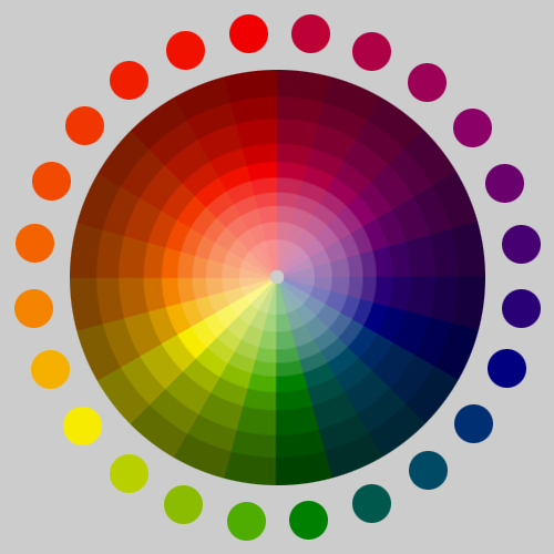
COMPLEMENTARY COLORS are diagonally opposite one another on the color wheel. -create the maximum contrast with one another. You can work out the opposite color to any primary color by taking the other two primaries and mixing them together. The result will be its opposite or ‘complementary’ color.


________________________________________________________________________
Analogous Colors- colors next to each other on the color wheel


______________________________________________________________________
Value usually refers to the amount of black or white added to a color:
Saturation refers to the amount of a color or hue used. When a color is fully saturated, it is very vibrant. When a color is “desaturated,” a large amount of the color has been removed. Desaturated colors tend to be close to being neutral because there is so much gray in them.
MORE WAYS TO EXPLAIN
Value is the lightness or darkness of a colour. Saturation is the brightness. When you add white to a colour, it gets lighter in value, but it also loses saturation. That could be where the confusion comes in. However by adding grey, or the complimentary colour if it's the same value, you would lose saturation without losing value. In other words the colour would become less bright but not less dark.


THIS MATERIAL ABOVE WILL BE TESTED ON OCTOBER 15 (in a week and half)
Make sure you understand it all and study this site for the exam.
How colors react to each other when placed next to each other
http://www.worqx.com/color/palette.htm
No comments:
Post a Comment