Wednesday, December 5, 2012

Art contest

I received an email about an art contest from the Space Foundation and I think it would be a fun project for the art students to enter. 

The prizes are not SUPER but getting the award could be a good thing for your college applications if you were to win.  Plus I think the theme of the project is kind of fun AND it would be a good way to decorate the school just in time for Science fair in Feb.

I am going to have this be project and you will be able to work on it in class, 
In the meantime I would like you to start doing some brainstorming and some sketches for your next sketchbook assignment due Monday Dec.17 when we will start the project

For the contest the work can be either
Drawing
Painting/Mixed Media (as in collage, or mixing painting and drawing)
or
Digital (taking your own drawings or paintings or photos and using photoshop)

I want them to be the largest size they are allowing- 18 x 24 inch


I would like you to BE CREATIVE with this.  Think about the theme "If I were going"...... as in going to take a trip to outer space.  There is a lot of potential ways to go about it and I think the Surrealism project would be a good foundation for you since you really are going to have to think OUT OF THIS WORLD.

Some potential ideas:
Outer space fashion- what would you were on the ultimate vacation?
Space travel brochure- advertising travel to space
Outer Space hotel/resort- what would it have?
How would you breathe?- designing a stylish and functional oxygen mask
Pop Space Art- think out of this world Andy Warhol
Flag design for the universe
Aliens you might meet- what could they look like- BE CREATIVE if you do this one, in other words, no Yoda or Chewbacca......
Design your space ship.... again, NO Milenium Falcons or X-wing fighters.....

Artists who can inspire you:  GOOGLE them and see how their ideas could influence yours-
Alex Grey
Pearl C. Hsiung
Jeremy Geddes
Peter Max + space
Roger Dean + outerspace
Or just have fun with google images;  artists outerspace   ,    modern art outerspace,   
http://we-make-money-not-art.com/archives/2008/04/chinese-contemporary-art-beyon.php#.UL-8j4OsiSo


Here is the information about the contest rules PLEASE READ and if you want you can also look at the entries from past contests -

http://www.artsonia.com/museum/collections/detail.asp?coll=265

IMPORTANT DATES-
Dec 17 Sketches/brainstorming due
Dec 17, 19,  Jan. 7,  9 and 14 to work in class-  5 classes  
Due by Wen. Jan 16th NO EXCEPTIONS!!!!!!

Sunday, November 25, 2012

Powerpoint on Artist you chose

You are to create a powerpoint on the artist you chose.

You should show their work, give a basic bio of the artist, and have basic text on your slides

(tip- do not have text slides separate from images and also show clear images but do not have visual overload on slides)

The powerpoint is due December 3. 
You need to sign up for http://www.slideshare.net 
Upload your presentation and then EMAIL ME THE LINK BEFORE THE CLASS Dec 3.

Your powerpoint will be graded as a project grade and will be graded on:

-How visually interesting is the material you together
-How much effort you put into gathering information but also keeping the text information concise and descriptive
-How much effort you put into gathering images of your artist's work.
-How well the flow of the information is put together
_______________________________________________________
Presentations are to be about 10 minutes each- if you go too long I will have to take points off .

You will be presenting your artist to the class on December 10th


For your actual presentation you will get a classwork grade based on:
-How informative is your presentation?
-How accurate is your presentation?
-How engaging you are in presenting the material.
-How well your visuals are explaining and illustrating your topic to the class
-Does it have a good flow and stay within 5-10 minutes

Sunday, November 18, 2012

Searching for inspiration

1. Search online for different artists who you find inspiring. (you can use the links on the left side to look at these sites to see different contemporary artists- or just search around google)

2. Choose an artist you like and write a blog comment here describing why you chose this artist, talk about the materials they use, and the subject matter of their work. Try to talk about a few of their pieces, not just one work Should be at least a full paragraph.
Due Monday Dec 3- (one week from today)

3. Prepare a short presentation on the artist and their work.  Be sure to show examples of their work.
Make a powerpoint and load it to slideshare.net.   THEN EMAIL ME THE LINK BY THE DUE DATE
December 10th (which is 2 weeks from today)


Tuesday, October 23, 2012

Assignment planning


Start looking for materials for a collage.  Any materials you can bring in and would want to use
Magazines
Photos
Papers
Cardboards
Advertisements
textured materials
string
fabrics

Start bringing things in asap.  We will need it next week. Be sure to have your materials with you Wens.

Sunday, October 14, 2012

Sketchbook Due Oct 24

Draw at LEAST 5 objects that you think of as visually interesting, mysterious, or remind you of something that is strange.  You can use google images to come up with your ideas.   Due Wens Oct 24

Wednesday, October 10, 2012

Reminder

Test on Monday on Color Theory information below and sketchbook due

Tuesday, October 2, 2012

Due Oct 15

Do 3 landscape drawings.  Look at actual landscapes- not photos.  Use color pencils.
Can be any aspect of landscape and in any style.
FULL page drawings.  You have almost 2 weeks for this assignment.

ALSO study the color theory information for a test Oct 15.  DO NOT PROCRASTINATE!

Color Theory

THE SPECTRUM

The spectrum is the colors of the rainbow arranged in their natural order: Red - Orange - Yellow - Green - Blue - Indigo - Violet.

The mnemonic for this is ROY G BIV.


Additive Color involves the mixing of colored light. The colors on a television screen are a good example of this. Additive primary colors are red, green and blue.

Subtractive Color involves the mixing of colored paints, pigments, inks and dyes. The traditional subtractive primary colors are red, yellow and blue.

This blog examines the terms used to describe Subtractive Color.


HUES
A hue is one of the colors of the spectrum.
Hues have a circular order as illustrated in the color wheel .


PRIMARY COLORS Red, Yellow and Blue are the primary colors. These are the three basic colors that are used to mix all hues.

SECONDARY COLORS Orange, Green and Purple are the secondary colors. They are achieved by mixing two primary colors together.


TERTIARY COLORS are more subtle hues which are achieved by mixing a primary and a secondary color that are adjacent on the color wheel.


 TINTS- colors with white added to lighten
SHADES- colors with black added to darken


COMPLEMENTARY COLORS  are diagonally opposite one another on the color wheel. -create the maximum contrast with one another. You can work out the opposite color to any primary color by taking the other two primaries and mixing them together. The result will be its opposite or ‘complementary’ color.


________________________________________________________________________
Analogous Colors- colors next to each other on the color wheel


______________________________________________________________________

Value usually refers to the amount of black or white added to a color:
Saturation  refers to the amount of a color or hue used. When a color is fully saturated, it is very vibrant. When a color is “desaturated,” a large amount of the color has been removed. Desaturated colors tend to be close to being neutral because there is so much gray in them.

MORE WAYS TO EXPLAIN 
Value is the lightness or darkness of a colour. Saturation is the brightness. When you add white to a colour, it gets lighter in value, but it also loses saturation. That could be where the confusion comes in. However by adding grey, or the complimentary colour if it's the same value, you would lose saturation without losing value. In other words the colour would become less bright but not less dark.


THIS MATERIAL ABOVE WILL BE TESTED ON OCTOBER 15 (in a week and half)
Make sure you understand it all and study this site for the exam.


How colors react to each other when placed next to each other
http://www.worqx.com/color/palette.htm

Sunday, September 30, 2012

Parsons visiting Taipei


Parsons The New School for Design from New York will meet students interested in pursuing degrees at Parsons.
Information Session: Taipei
Date: Sunday, October 7, 2012
Location: Hotel Éclat, Taipei
No. 370, Section 1,
Dunhua South Road, Da-an District,
Taipei City 106
Taiwan
Time: 3:00 PM - 5:00 PM

If you are able to go please come see me this week to sign up. 

Tuesday, September 25, 2012

Due Oct 3

1st Check out and explore the link on the LEFT
Virtual Art Museum through GOOGLE Art Project

Find art that you like and make note of them listing the artist and the title.
Then in the comment section of this posting list your top 5 artists and works that you chose.

NOTE- for Monday Oct 1 BRING YOUR SKETCHBOOK, PENCIL SET, and COLORED PENCILS as well as an eraser.  

Wednesday, September 19, 2012

IMPORTANT- read and get these asap!!


Because of the large number of art students we currently have and because many are in our various courses offered we need to now have students purchase required supplies for each class.   

Note that you do not buy books for this class- your supplies are your tools.  If you have trouble finding something let me know. 


Each student needs to get these materials asap if you do not have them already BUT you need to have them in class to be able to use them. If you dont have them then you cant work and if you are not working you will get deductions for participation/studio habits grades each time you do not have them.  So this is really important.  


NOTE that lists are listed mostly for 2D and there is a list for 3D at the bottom.  If you are taking 3D next semester you need to have those for that class. 


SUPPLY LIST 

Of course EACH CLASS NEEDS A SKETCH BOOK (a 9inch by 12 inch size preferably)

NOTE Some items below are also for 3D but absolutely for 2D.  Those for 3D are noted. 

Items you need to buy immediately and have ready to use in every class:


MOST IMPORTANT!!!
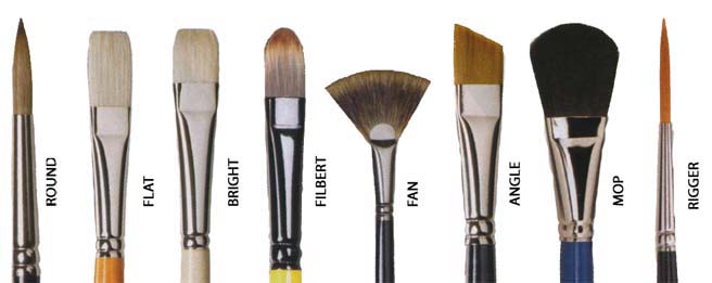
-set of brushes   (FOR 2D and 3D classes)
You should have a variety of sizes  and types.  Here are the names of brushes.  Realize that better quality brushes will work better, but will cost more money. 
Also realize that you should some brushes you only use for watercolor- ask at the art store

You might not need a MOP or RIGGER but they can be helpful.  A MOP would be for watercolor


-Brush holder to safely carry your brushes.  You need to take care of them and make sure they are cleaned as well as do not get bent .  (FOR 2D and 3D classes)


-set of watercolors and paint tray.  Again you pay for what you get.  The better paint will cost more and the more colors you have the more you have to work with.  
Get a good brand like Windsor Newton.   They can be tubes or a palettes
Also you might want to get a set of Gouache paint as well


-Some of you have them already but you need to be sure you have FULL pencil sets   (FOR 2D and 3D classes)

-Kneadable erasers, a magic rub, and a regular eraser   (FOR 2D and 3D classes)


-variety of sizes of sharpie markers in black   (FOR 2D and for 3D)
You can also get other color sharpies if you wish but you should get the ultra fine points and the fine point or the twin point in black


You should get a good set of markers 
Yes sharpies are expensive but they are the best, next is prismacolors, or derwent.  
NOTE--Cheap ones dry up quick so you just wast money in the long run.  Taking care of good quality markers properly you can have them a long time.


 - portfolio to carry your work back and forth from home to school.  DO NOT ROLL UP OR FOLD YOU WORK ANYMORE.  
You can get a card stock portfolio or a better quality one. 
 It should be for work in progress, not one that has your old work stored in it and it needs to be at least 20 inch by 25 inch or larger.
Google search Art carrying case portfolio


-Compressed charcoal-  a box and maybe two of different hardness

-Rubber Cement


 -A set of colored pencils.  If you get the better brands like PRIMSACOLOR or DERWENT or Faber Castel you will see the difference in your quality outcome and if you get a larger set than you have more options to work with.  And like the markers and watercolors, the more colors you get the more tools you have to work with.


Masonite light weight artist's board (ideally a 45 inch wide board-  but no smaller then 25 inch wide)  and it doesnt need to have the clip on it
Lastly but not least- Artist's QUALITY PAPER
You know that the paper we have in class is not that good for doing drawing and it is dreadful for watercolor but its is worse for charcoal and pastel since it does not have texture or a "tooth" as its called. 

I suggest you get a few large sheets each of these to during the year- get a few of each to start and you can cut them down to the sizes you need. 
NOTE THESE ARE FOR PROJECTS NOT FOR SKETCHING- use your sketchbook for that.


Strathmore® drawing Paper is available in 300 Series drawing paper, 


Strathmore Charcoal Papers
 

Strathmore Pastel Paper comes in many textures and shades to create the ideal background for pastel paintings.


OPTIONAL SUGGESTED ITEMS------------------------------------------------------------------------------------------------- 

-spray paints in the colors you want to use   
 (FOR 2D and 3D classes)

-artist's tape to adhere paper to the masonite boards

- Reed pen or other pen quill for pen and ink drawing

-watercolor colored pencils set

-A top quality artist's watercolor brush -#6 sable or red sable brush. Note-- a red sable is an investment and if you take care of it you can have it for the rest of your life)


and I strongly suggest you get an art bin or box or bag to carry these supplies with you (btw all art students always have to carry their materials to classes so get used to it now)


-----Specifically for 3D classes
Elmers wood glue
Metal glue (scotch brand tubes)
ceramic glue (scotch brand tubes)
glue gun with glue sticks
masking tape
plastic tape
wire of various gauges (sold in rolls or in packages)
Assorted 9x11-5/Pk Sandpaper
Cellfoam 5mm thick- a few sheets
Cellfoam10mm - a few sheets
Spray paint in the colors you might want to use
And of course you should be looking around for materials you can use from everyday life- 
recyclables of all kinds. 

Monday, September 17, 2012

Due Sept 26


Perspective
One point perspective shown here http://studiochalkboard.evansville.edu/lp-seeingA.html

Two point perspective shown here http://studiochalkboard.evansville.edu/lp-in2A.html


Do a drawing of each type of perspective.  Can be interior or exterior
Due next Wens Sept 26

Tuesday, September 11, 2012

Sketchbook due Sept 19

Your next sketchbook assignment is to draw 5 full sketches of your hands.  Each drawing should have a different pose.  Each drawing should only be WITH LINE  (CONTOUR LINE DRAWINGS).  Do not use shading.  Look at how lines create the shapes. Try not to think about what you are drawing. Just look at the lines and the shapes as well as the NEGATIVE SPACE.

Consider drawing LARGE- do not do little drawings.  Each one should be a full page and possibly larger than your actual hand.

DUE NEXT WEEK WENS Sept 19

Thursday, August 30, 2012

Assignment due Sept 12

Now that you should all have a sketchbook for this class, your first homework assignment is to do do at least 5 drawings (meaning 5 different pages of full sized drawings) of objects that you look at (aka DRAWING FROM OBSERVATION).  I would like you do do the drawings large- and potentially larger than the actual size of your object.

DO NOT USE PHOTOS- look at actual objects!

DUE AFTER CAMP PAS- WENS SEPT 12 in class.

If you do not do the full assignment you cannot get full credit.
If you do not have it in on time you will get deductions.


Thursday, August 16, 2012

NEW YEAR 2012 2D class--Sketchbooks


SKETCHBOOKS
MUST be at least 8 inch x 12 inch and MUST be a brand new sketchbook.


Being a good 3D artist means LOTS of sketching.  Ideas need to be developed and enhanced and sketching helps this process along.  The ability to render your work on a 2D surface as well as a 3D one is what all great 3D artists do. Perseverance and practice will help you improve your ideas.


1. DO NOT make “perfect” drawings. Make imperfect drawings; make mistakes; make false starts.

2. ALWAYS FILL the page you are working on. Go off the edges whenever possible. Do not make dinky little drawings in the center of the page. Make every square inch count for something.

3. Do not start something and abandon it. Go back later, change it, and make it into something else. Being able to rescue bad beginnings is the sign of a truly creative mind.

4. Always finish what you start no matter how much you don’t like it.

5. Fill at least half your sketchbook before school begins.

6. Put the date on every page you finish.

7. NO CUTE, PRETTY, PRECIOUS, ADORABLE images. This is a college-level art class, not a recreation program
to make pretty pictures to hang in your house. Expect your ideas about what makes good art to be challenged.

8. Don’t be boring with your work.  Be expressive and do drawings for the purpose of planning something grand

9. Avoid showing your work to others unless you know they are going to understand what you are trying to do in your sketchbook. You do not need negative feedback when you are trying out new ideas or experimenting. This is a place for risk taking.

Sunday, April 15, 2012

Tuesday, April 10, 2012

3D RELIEF

3D class-  GOOGLE SEARCH IMAGES

High relief examples
Bas Relief examples
Carved Relief examples

search through the images and explore the different approaches to relief.
think about doing some sketches if you feel inspired to do so.


then read this to understand the differences
http://corinne-shibley.suite101.com/sculpture-as-relief-an-enduring-art-a162083

Wednesday, February 29, 2012

3D study guide ELEMENTS AND PRINCIPLES of ART

please use this site to study for the test on March 21
 http://www.projectarticulate.org/principles.php

Elements of ART
Line
Texture
Space
Shape
Color

Principles of ART
Proportion
Emphasis
Rhythm
Unity
Variety
Pattern
Balance
- I am adding-- Contrast
(Some of these work together and some sources use other names to describe them but these are the tools and terms to use when creating visual art)


Tuesday, February 28, 2012

HONORS assignment

This week spend some time on this site
http://www.behance.net/
View the artists work in the galleries.
Choose one you really like.
Then come back here to comments to post the link of the artist and write about why you chose that artist.
This is due March 12th

Wednesday, February 22, 2012

3D artist presentations

Please list your artist under this post on the comment section AFTER reading the comments posted to see if your artist has already been chosen.


btw Jerry Liu chose Auguste Rodin in an email to me


thanks
Mrs. Jones

Tuesday, January 10, 2012

In the comment section here, reply to these questions.
DUE NEXT WENS.  1/18

1. What do you think was the most successful project or assignment for you this semester?
2. Do you think the sketchbook was a valuable assignment?
3. Honestly, do you think you could have put more effort into your projects?
4. Honestly, do you think you could have put more effort into your sketchbook?
5. Honestly, do you think you could have put more effort into your  written assignments?
6. Honestly, do you think you could have put more effort into your presentation?

7. What do you think was the most valuable part of the class?
8. What do you think could have been done better?

9. If you are in the 2D studio class do you plan to take 3D studio next semester?
10. Are you considering taking AP2D and or AP3D studio class in the future?